Time Master 70
Product Concept
Details
How do you transform a classic from the 1970s into a visual experience that resonates with today’s consumer? That was the challenge presented to us by Ferro & Company, a Canadian brand that has sold thousands of watches in more than 70 countries, winning a loyal audience by combining vintage design with modern sophistication.
For the launch of the new Time Master 70’s color variation, founders Ary and Bob embraced 3D as a strategic move to elevate the brand. With the industry evolving and competitors exploring CGI, Ferro saw an opportunity to expand creative possibilities, deliver richer storytelling, and strengthen the brand’s perceived value in a market that demands innovation and refinement.
In the first briefing sessions, the client had a well-defined idea: to create a short animation in which the watch would appear in a striking, nostalgic setting before guiding the viewer’s eye toward close-up shots that revealed the product’s details.
Art Direction & Concept
Before building the scene, we studied Ferro’s audience, history, and visual language. Using AI accelerated concept validation and opened creative paths that wouldn’t have surfaced otherwise. This led to two rounds of concepts, the first rooted in 1970s nostalgia, featuring classic cars and bold, era-defining details.


Set Design
With the concept approved, we began building the 3D environment to evoke nostalgia, a powerful tool for creating trust and familiarity. Materials and textures tied to masculine archetypes shaped the scene: leather to convey craftsmanship and wood to add warmth.
Every element supported the story. Bauhaus-inspired graphics added a subtle retro-artistic touch, aviator sunglasses with orange lenses echoed the watch’s crystal details, and props like a whiskey glass, vintage newspapers, and the warm glow of a setting sun anchored the composition in its era.


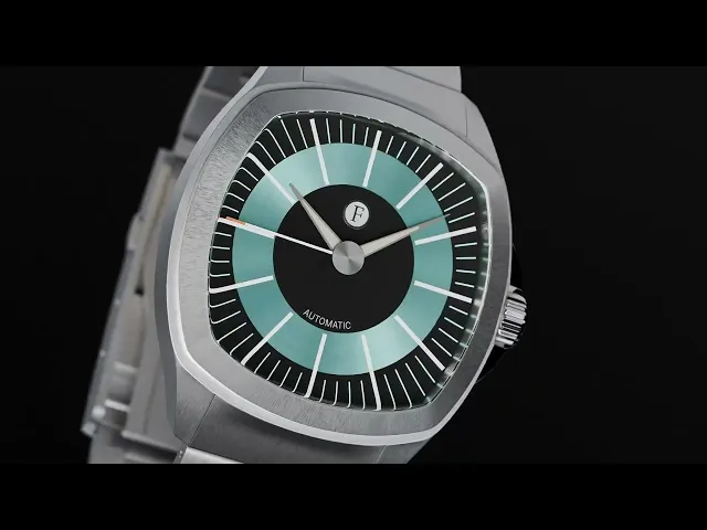
During the scene stylization phase, we also began modeling the watch. Once the model was complete, we moved into look development, creating high-quality textures with maximum fidelity to the original piece.


Animatic & Camera Movements
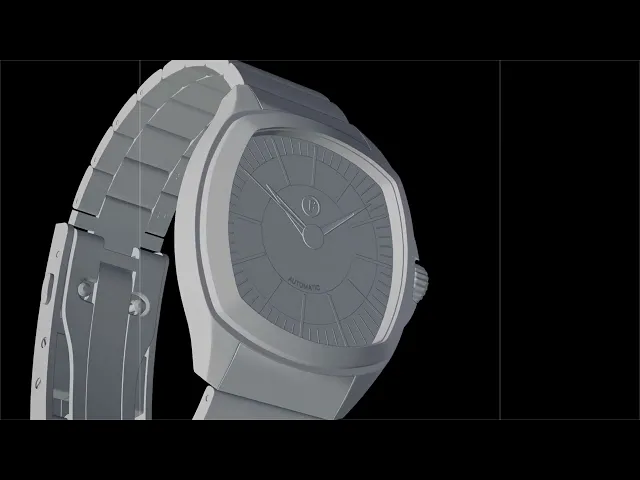
The animatic was a key step in defining the scene’s direction, mapping camera moves, timing, and overall flow. It allowed the client to give feedback early, ensuring alignment and saving resources before moving into full production. Even in its rough outline, the watch was already taking shape with the atmosphere that would carry through to the final render.


Rendering & Final Deliverables
All materials were delivered in multiple formats to ensure compatibility and versatility. Along with the final 4K (16:9) animation focused on visual storytelling, we produced optimized versions for social media and high-resolution stills for campaigns and e-commerce. We also advised the brand on future 3D integrations for their website, expanding how the content could be used across platforms.


Credits
Client: Ferro & Company
Production: Prosper Visuals
Asset Creation, Lookdev, Animation: Alberto Cristino
Scene compositing, Lookdev: Mateus Otto